Customization without the engineering queue
A configurable component system that gives operators room to express their brand while protecting the structure underneath.
Designed for an existing ecosystem of 10+ operator brands · Casino first
The assignment
InPlaySoft is a cloud-based iGaming platform for casino, sportsbook and esports, serving an ecosystem of operator brands with 1M+ monthly active users. Small front-end changes kept interrupting engineering and took too long for operators. I proposed a configurable component system and a catalogue that could become the shared reference for how those components work. The CEO gave me the autonomy to develop the idea, and the system is still being built.
- Role
- Senior Product Designer
- Origin
- Self-initiated · CEO sponsorship
- Timeframe
- 2025–2026
- Status
- In construction · Casino first
- Ownership
- Design, system and documentation
One platform, many expressions
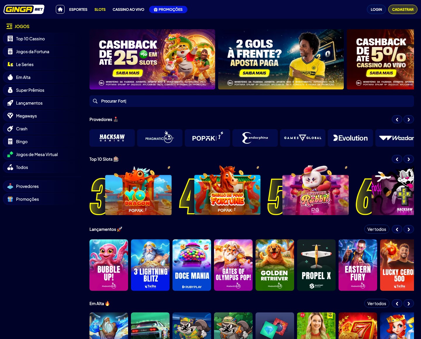
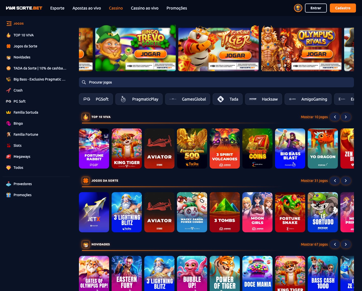
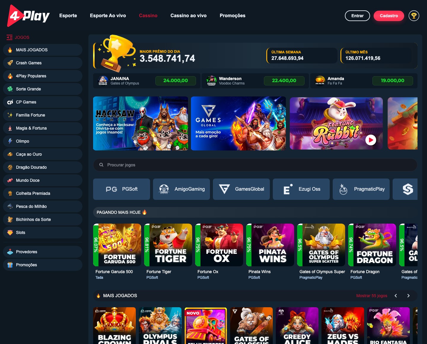
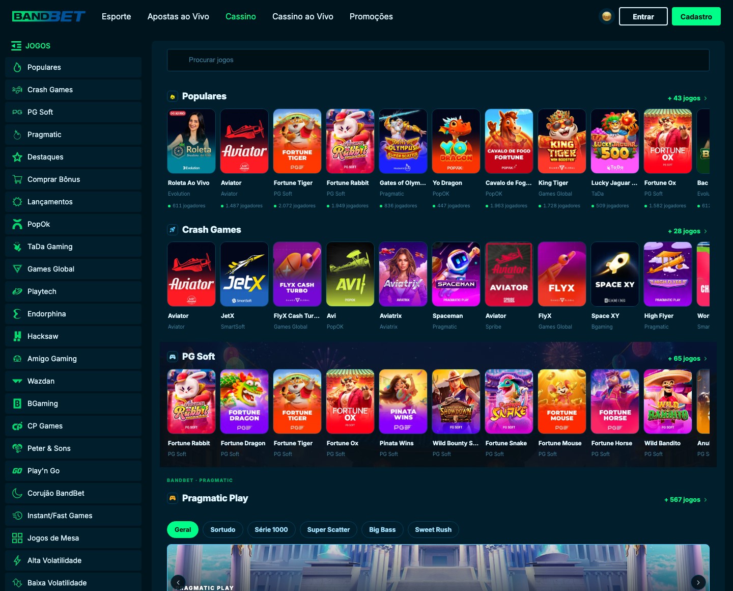
Every brand on the platform looks different. Customization was never the problem. Operating it was.
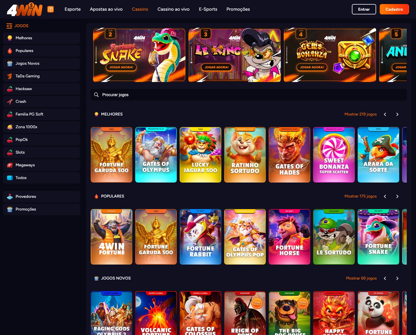
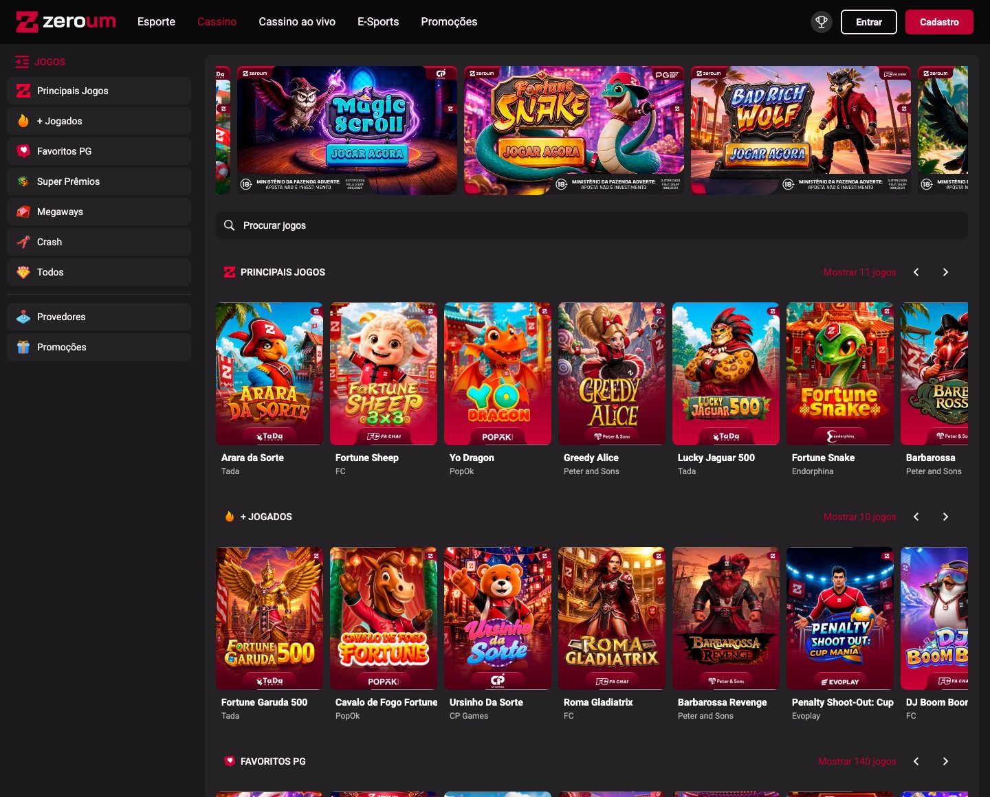
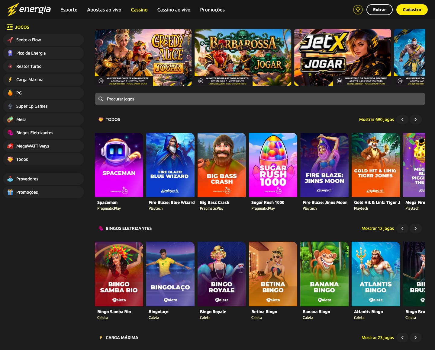
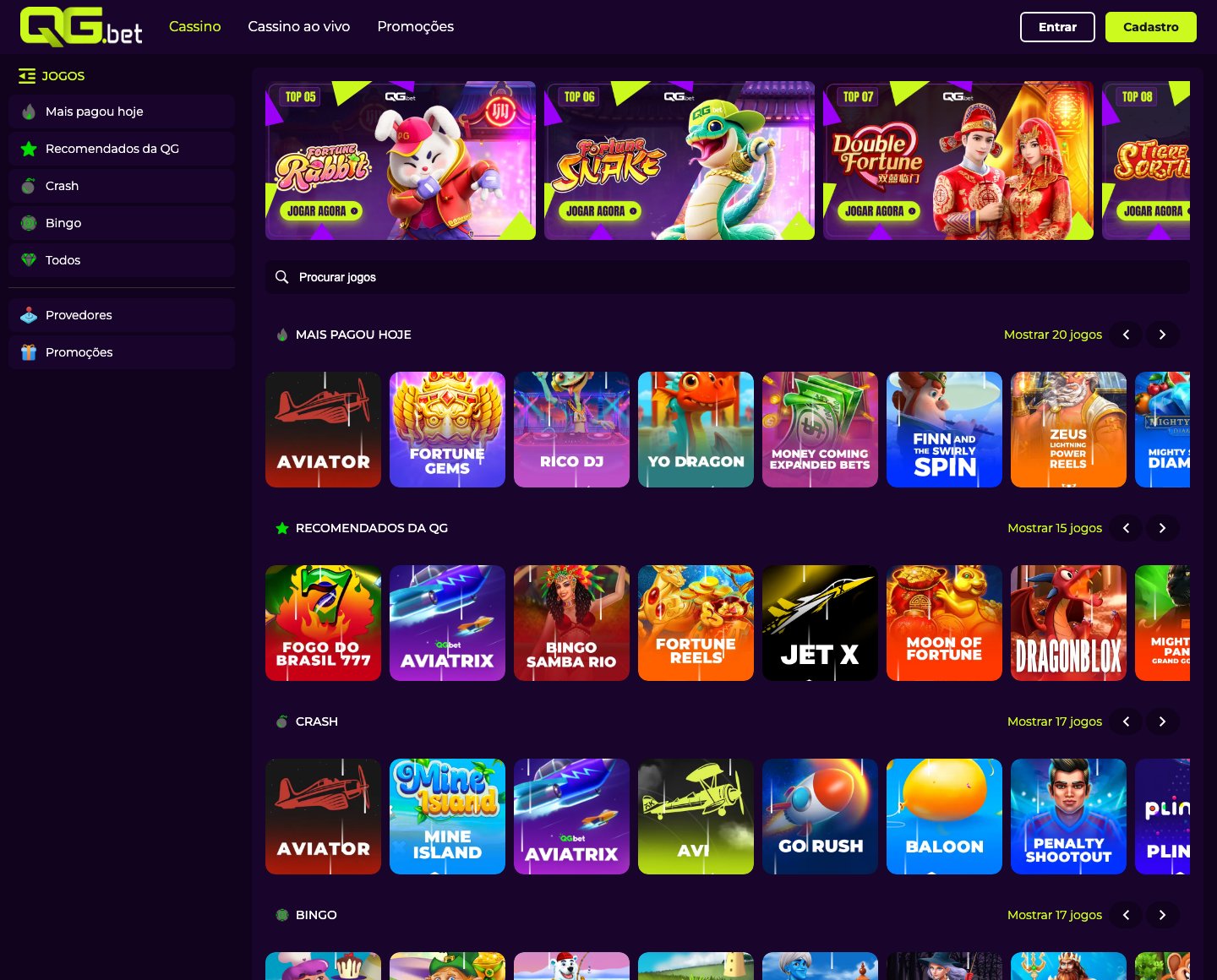
InPlaySoft’s white-label platform serves an ecosystem of operator brands: GingaBet, Viva Sorte, ZeroUm, 4Play, 4Win, BandBet, QG.bet, Energia and others. Each is a visually distinct brand over the same recurring product architecture.
The friction was in how that flexibility was operated. Small front-end requests kept pulling engineering away from more urgent work, while operators waited for changes that should have been simple. A Page Builder was already available, but it was complex, data-heavy and required substantial training, so those requests kept flowing through engineering.
A different model
Give operators room to change what expresses their brand, and lock what holds the product together.
I proposed a different operating model: instead of requesting every change or learning a heavy builder, operators would configure components within defined boundaries. The CEO gave me full autonomy to develop the idea. This was not a component library assignment. It started as a proposal.
The model is controlled flexibility. Operators get meaningful control over brand expression, while the rules that keep a component stable across devices and contexts stay with the system.
Freedom, with boundaries
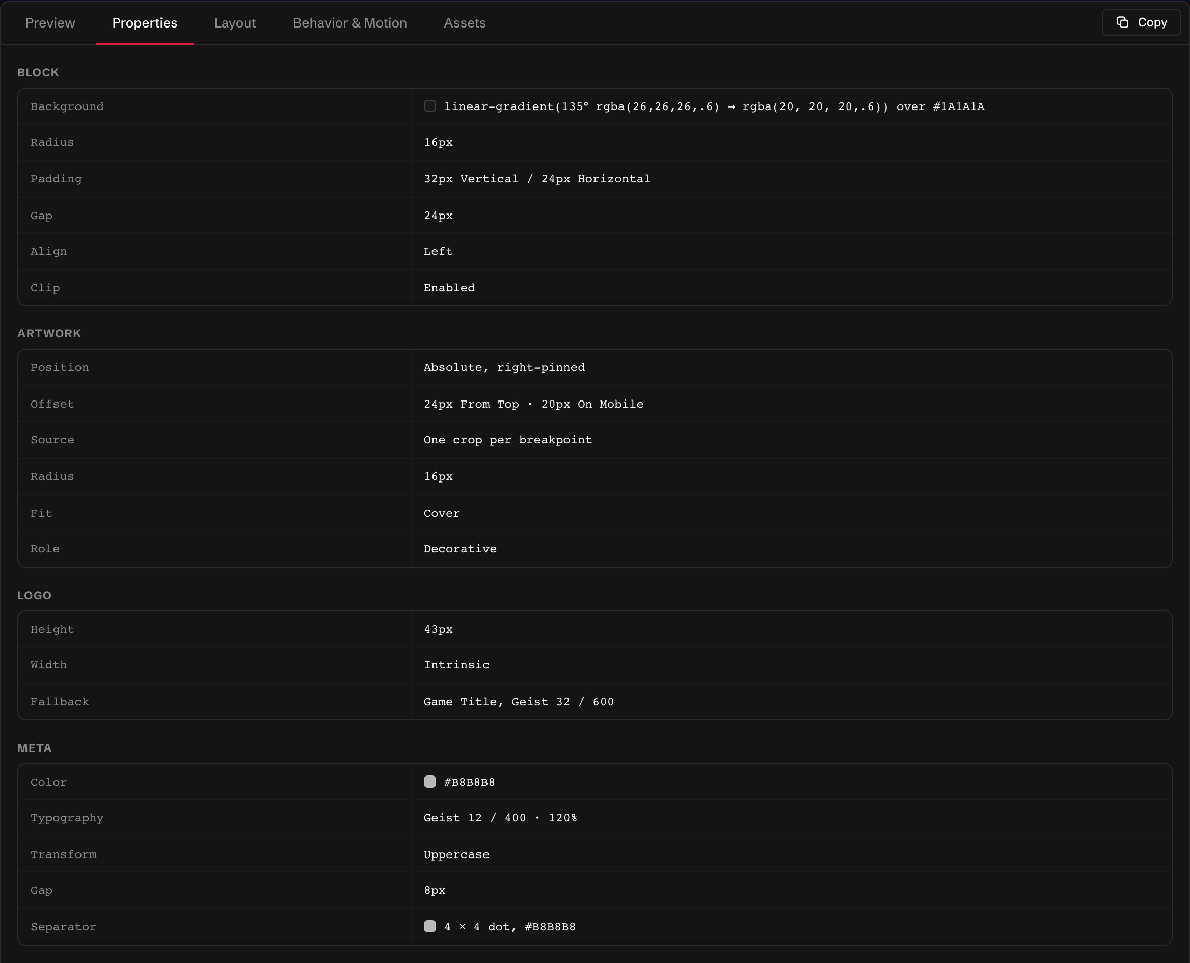
Inside a Jackpot, six brand properties can change. Sizing, spacing and responsive structure stay with the system.
Jackpots became the working example for that boundary. Operators can change imagery, motion, borders, typography, colors and variants. Sizing, spacing, viewport rules and the underlying structure remain governed by the system because they determine how the component holds together across devices.
- Brand expression
- Imagery · Motion · Borders · Typography · Colors · Variants
- System-defined
- Sizing · Spacing · Viewport rules · Component structure
Designing the rules
Defined in Figma first, refined as it was built.
- 01
Anatomy first, in Figma
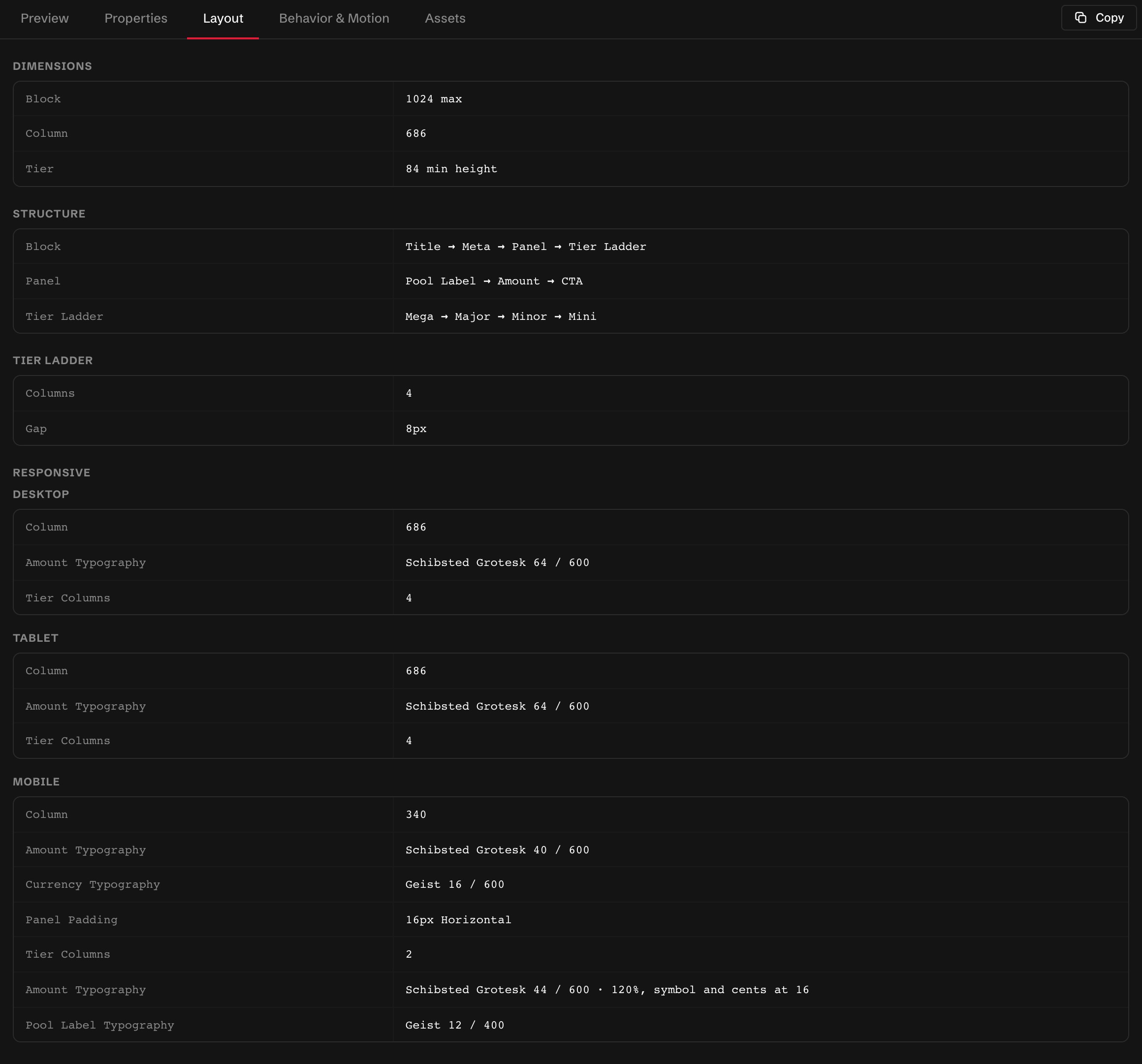
The system started in Figma in 2025. Each component was defined there first: its structure and anatomy, which parts exist and how they relate, which of them an operator may touch, and its variants, variables, tokens and rules. That initial architecture is where the component logic comes from.
- 02
Variants and exposed properties
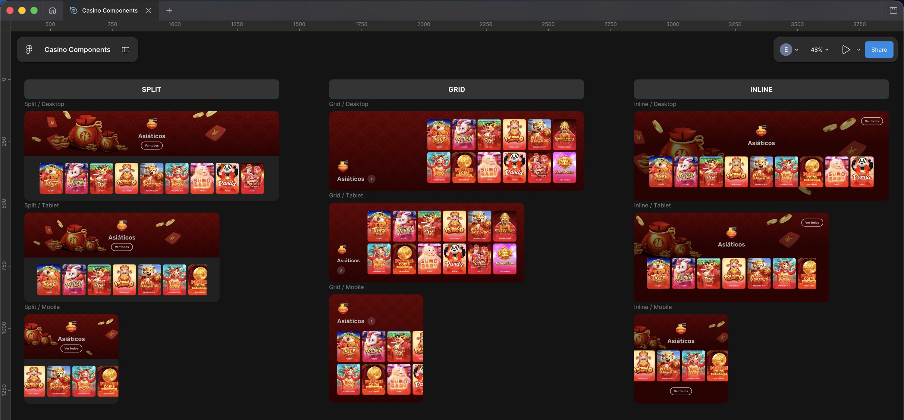
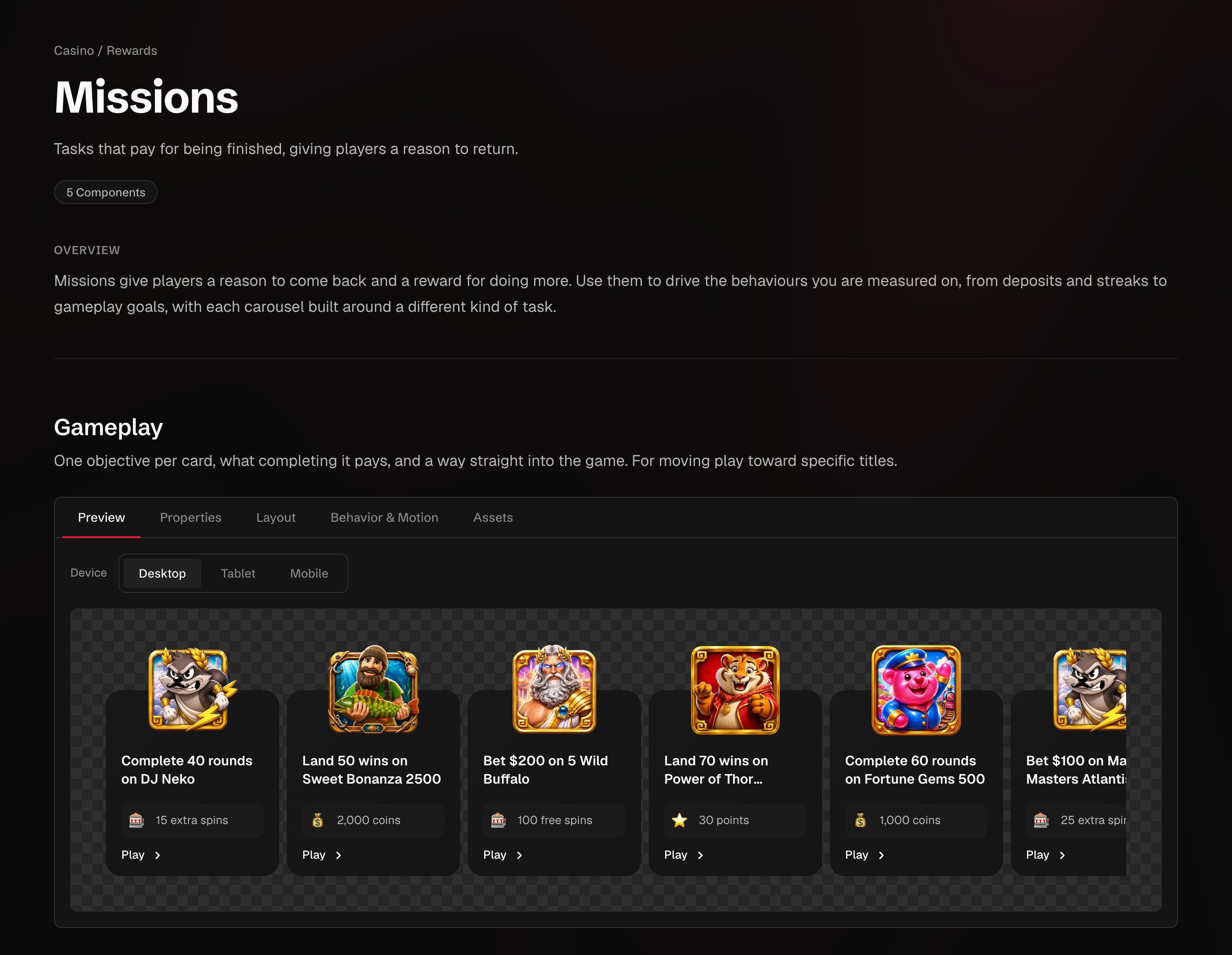
The variants a component offers, and the properties exposed for it. The Game Category Banners come in three arrangements, Split, Grid and Inline, each drawn for desktop, tablet and mobile. In the Jackpot, the exposed properties are imagery, motion, borders, typography and colors. Exposing a property is a decision. So is not exposing one.
- 03
Behavior and motion as part of the specification
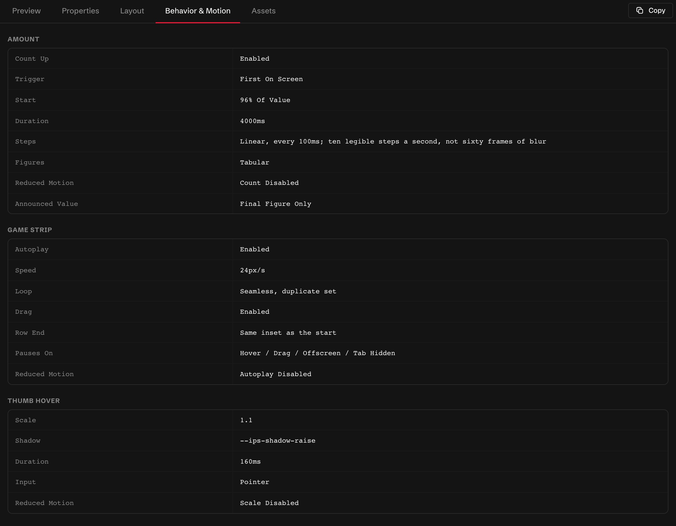
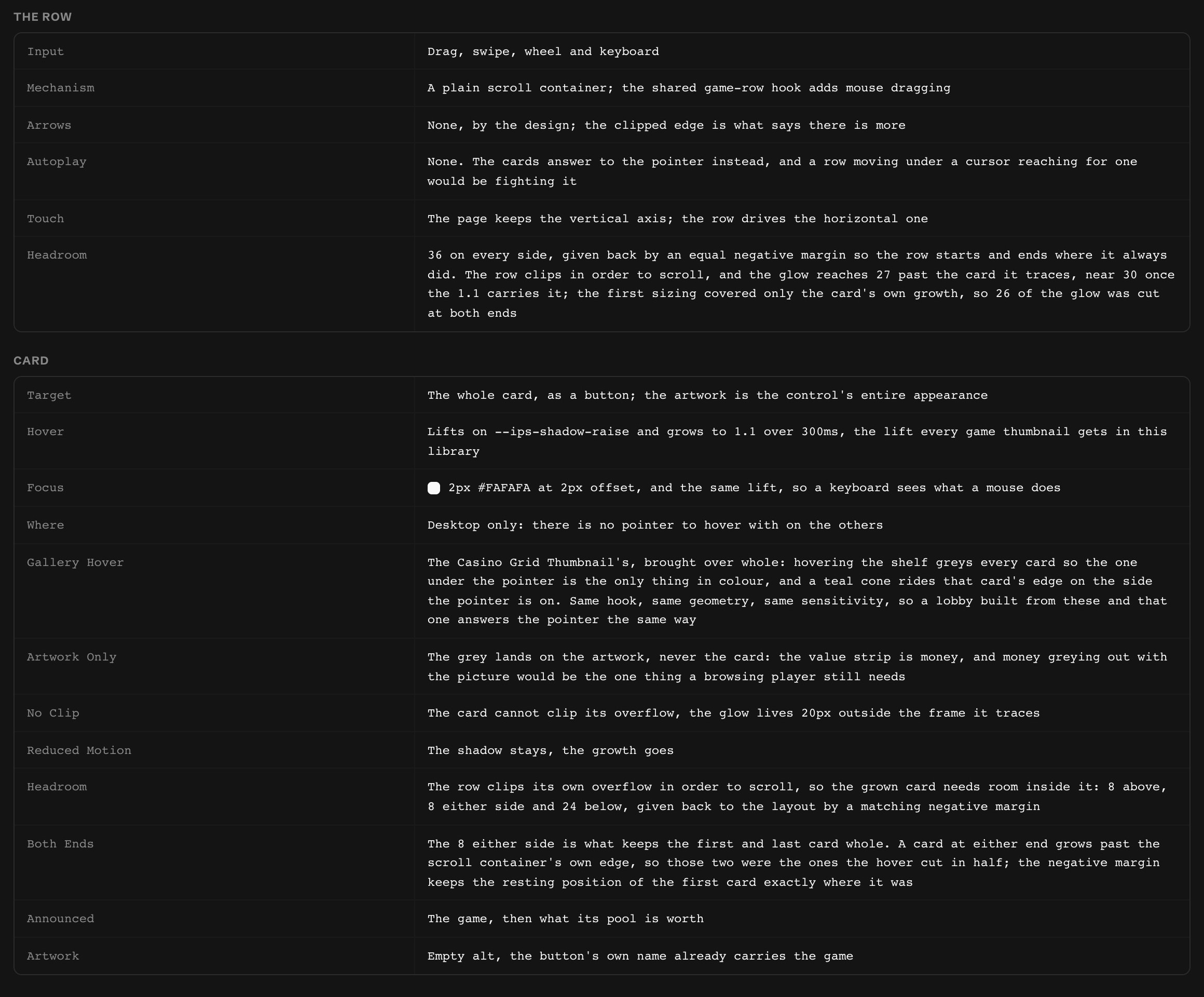
How a component moves and responds is written into its definition rather than decided at implementation: autoplay and loop, drag and swipe, easing, pauses on hover, drag, focus and hidden tabs, and what happens under reduced motion.
- 04
Accessibility inside the specification
Accessibility requirements are part of each component’s specification, not a separate review: contrast, with AA targets where applicable; ARIA considerations; and keyboard operation, focus behavior, announced content and reduced-motion rules, documented alongside the component.
- 05
Defined per device
Each component is defined and previewed for desktop, tablet and mobile, so a variant that holds on a desktop screen is checked on a phone before it exists in the catalogue.
From library to working catalogue
The system does not stop in Figma.
In 2026 I began turning the Figma definitions into a working catalogue on the platform. Each component page brings together its variants, the properties and tokens it is built from, behavior and motion, device previews, localized content and release history. The catalogue is the shared reference for how a component is defined and expected to behave.
- Figma Component definition: structure, variables, tokens, rules.
- Catalogue Shared reference and functional documentation.
- Claude Design Sync Component definitions made available to development during implementation.
- Development The development team implements the components.
- New Page Builder Planned operator delivery layer.
Working with the components functionally also feeds information back into the system, rather than making this a one-way handoff from Figma. Claude Code and Claude Design are part of how I implement, inspect and refine them in that environment. As the system grew, that process also made some limitations easier to see, including the need to introduce Semantic tokens when the original Primitive and Foundation structure became harder to navigate.
Reflection
I went into this thinking about customization as an operational problem: too many small requests, too many of them running through engineering. Building the system made a different question clearer. Not how much to make configurable, but where configurability should stop. Every property I expose gives an operator more control, but it also changes what the system has to account for across brands, devices and content. I ended up spending as much time deciding what should stay protected as deciding what should be configurable.